
MPL is India’s biggest digital playground—where casual taps turn into serious wins 🎮⚡.
UX/UI Design
Gaming
Facelift
MPL Broadcast
Enhancing Game Spectatorship & Engagement
The MPL Broadcast App let players do what they always wanted: show off their gameplay to the world (because what’s the point of winning if no one’s watching, right?).
The challenge? Build a tool that was simple enough for a casual gamer, slick enough to feel pro, and still packed with features like real-time chat (because shouting at the screen alone isn’t fun).
🔍 The Problem
Here’s the truth bomb 💣 MPL already had a broadcast feature, but it just wasn’t built for casual gamers in India. Instead of feeling exciting and intuitive, it felt clunky and confusing.
And while platforms like Twitch or YouTube Live were powerful, they were also too complex for MPL’s audience, who just wanted to hit “Go Live” and vibe 🎮.
-
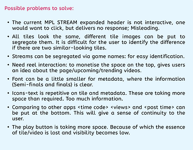
No clear CTAs
-
Misleading flows
-
Unorganized interface
The biggest blockers?
-
Poor Content Discovery
-
Overloaded UI
-
Hidden Key Features
-
Lack of Freshness
-
Large Tiles & Static Layout
👉 Bottom line: MPL Broadcast was supposed to showcase gameplay and drive tournament participation… but its design turned users away.
🎯 My Role
-
Led end-to-end product design for MPL Broadcast
-
Researched casual gamers’ streaming pain points
-
Defined clear user flows to reduce drop-offs
-
Designed a UI for media watchers.
-
Worked with engineers to align UX with tech constraints
🧪 Hypotheses
👮♀️ For Whom?
College student
-
22 y/o college student, casual gamer 🎮
-
Loves card games & small tournaments 🃏
-
Aspiring streamer, wants quick fame ✨
Frustrations
-
Confusing broadcast setup 😵
-
Hidden “Go Live” button 👀
-
Overloaded, messy UI 📱
-
Feels content looks stale 🥱
-
Drops off when setup takes too long ⏱️

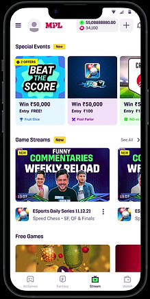
🔙 Before
-
❌ Poor Discovery → Hard to find streams
-
❌ Overloaded UI → Info dump = overload
-
❌ Hidden Features → “Play” button buried
-
❌ Static Layout → Repetitive, not dynamic
-
❌ No Freshness → Content felt stale
🔍 Research & Insights
We peeked 👀 into how the big guns (Twitch, YouTube Gaming, FanCode) were doing it — and here’s what we stole…uh, learned:
-
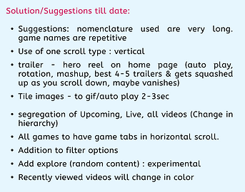
🧭 Easy Navigation = Happy Users → When content is neatly laid out, users actually stick around instead of rage-quitting.
-
🔄 Dynamic Content = Hooked Audience → Fresh updates + smart recommendations keep eyeballs glued.
-
🌑 Dark Mode Magic → A cinematic, focused vibe that screams gaming pro 🎮.
-
🧩 Tile Tetris → Smaller, smarter tiles = easier discovery + more streams explored.

🪜 User Flow (zoom inn for better view!!!)

🎨 Design Process
Design Decisions ✏️
-
👆 One-click “Go Live” → because nobody has time for 10 steps ⏱️
-
🎨 Minimalist UI → less clutter, more focus (goodbye cognitive overload 😵)
-
💬 Interactive chat & gifting → keep viewers engaged and happy like little dopamine hits
Iterations & Testing 🔄
-
⚡ Early prototypes = feature overload → testers = 😵💫
-
✅ Simplified to lean, essentials-only flow → validated with casual gamers
-
🏆 Result: easy, intuitive, and fun to use


✅ Glimpse of Final Output / Solution

-
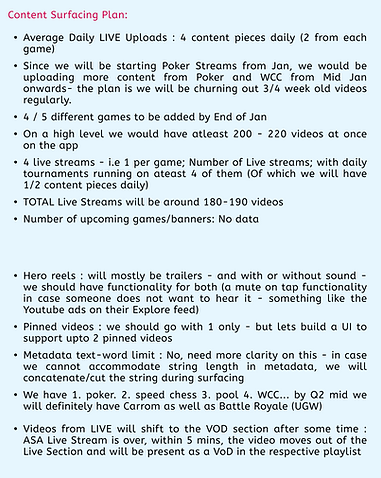
👆 One-tap “Go Live” → instant broadcast, zero friction
-
💬 Interactive chat → real-time engagement
-
🎨 Minimalist, mobile-first UI → clean, intuitive, low cognitive load
-
🔄 Dynamic content layout → fresh streams, easier discovery
-
🏆 Smooth, low-latency experience → reliable, enjoyable gameplay streaming
📊 Results & Impact
🚀
+35%
🚀 +35%
user engagement → users actually stayed!
🔍
+40%
🔍 +40%
content discovery → no more lost stream
🏆
🏆 More tournament participation → players got hyped
💡 Learning & Next Steps
-
🤖 More personalization → smarter AI recommendations to keep Carl hooked
-
💬 Interactive features → reactions & live comments for instant fun
-
🎮 Expand game coverage → more than just high-stakes rummy, give variety!
🏁 Conclusion
By combining UX/UI magic ✨, competitive sleuthing 🕵️, and user testing 🔄, we turned MPL Broadcast into a fun, dynamic, and intuitive platform.
-
🚀 Content visibility & accessibility improved
-
💬 Player engagement skyrocketed
-
🌟 MPL ecosystem got stronger → more users, more fun, more streams


